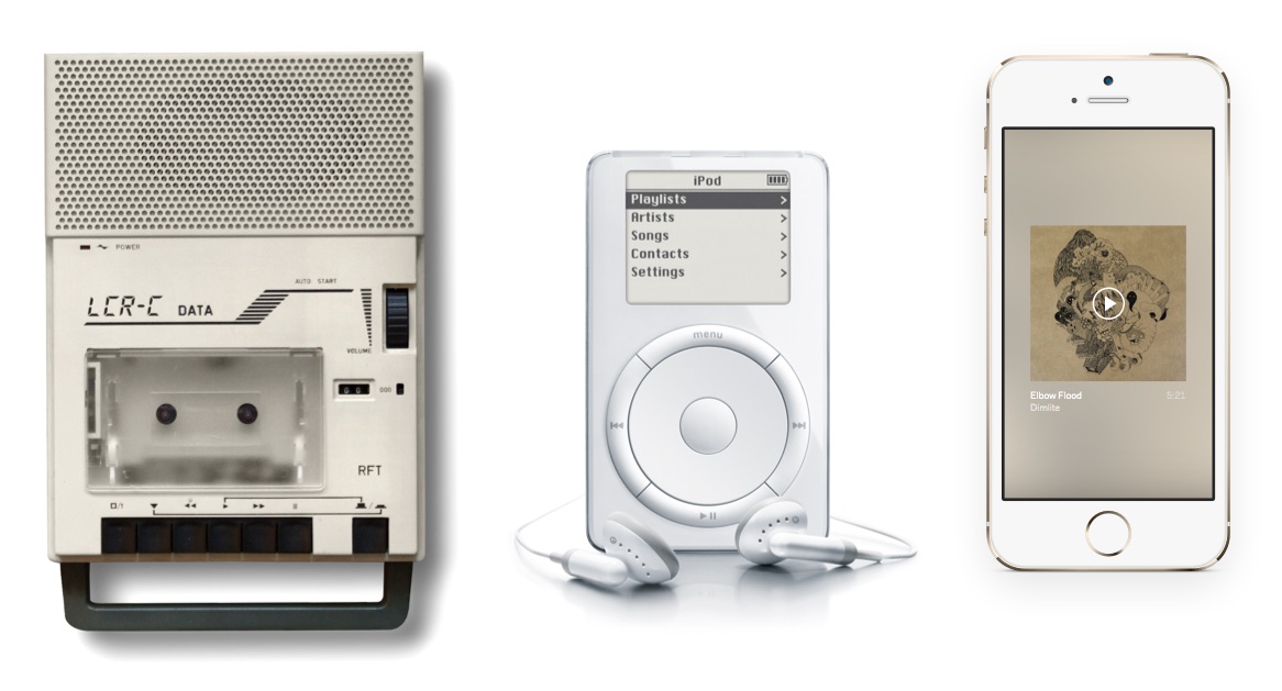
Interfaces of the past feature different physical controls such as buttons or knobs and in the future they will too recognize a multitude of gestures. But today we interact with products predominantly by touching a glass surface. The challenge and opportunity is to design interfaces that are inspired by the tactile reality yet open to imagination beyond that.

The dominant design for media Play and Pause controls emerged a while ago, however, the way we interact with these functions changed over time: cassette decks had the functions on separate buttons. Pause left the play head in contact with the magnetic tape and only Stop released the heads and disconnected the wheel motor from power to prevent damages. Digital players could then combine Play/Pause into a single toggle button with both icons on it. On-screen buttons can now change their appearance to only show the relevant icon at a time.
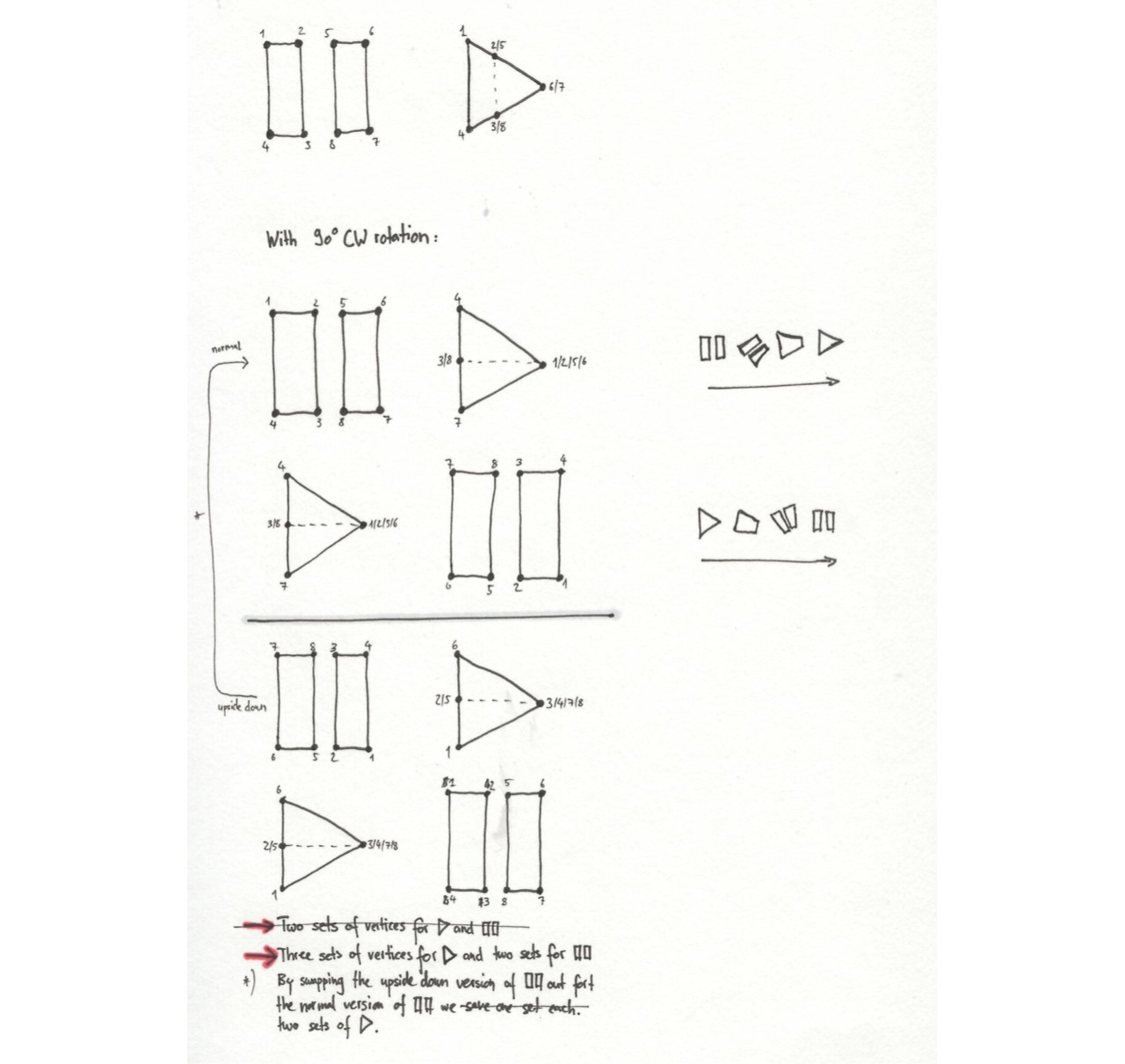
When such a change of state occurs and the interface on screen just snaps in place, I see a lost opportunity of the new possibilities to maintain continuity. The interface can transition itself over time to provide meaning and even delight. The Play/Pause button is an example I explored of this broader principle I see emerge. The affordance to toggle the established iconography lead me to morph between them. By sketching the transition of the vertices I came up with different styles, implemented them with CoreAnimation, and released a new UI control for iOS as free and unencumbered software into the public domain.

—